Keppie at 170: The Britannia Building (8 of 12)
- Written by
- David Ross
- Listed in
- Posted on
- 30th Aug 2024
(Top image courtesy of Nebo Peklo)
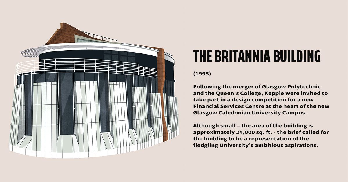
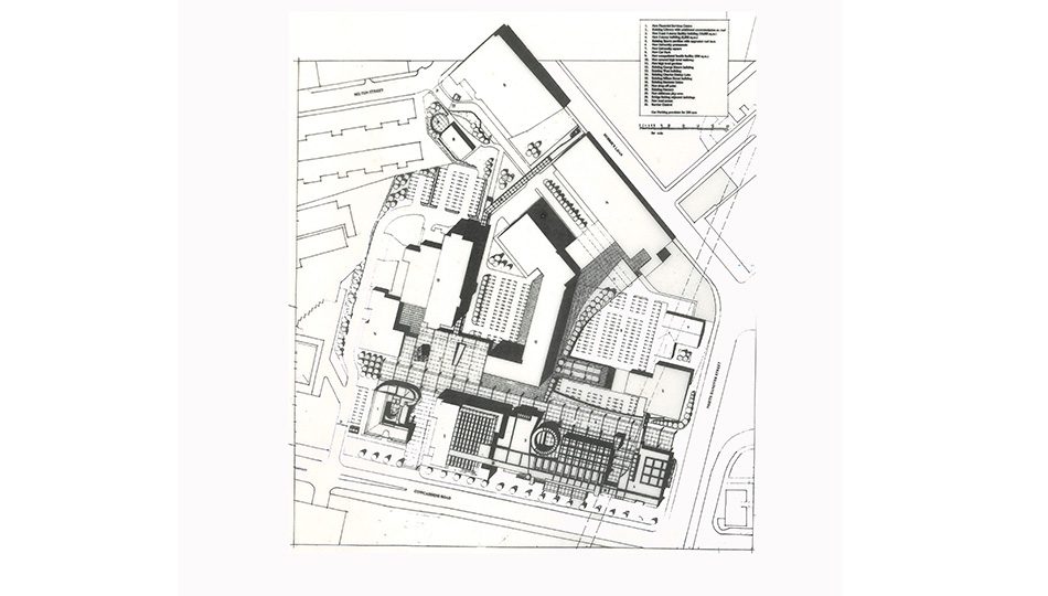
The dual mission of the Financial Services Centre was to be part of a vibrant city-centre education environment whilst portraying the flagship image of a corporate headquarters building. The plot allocated for it bookended the University promenade.
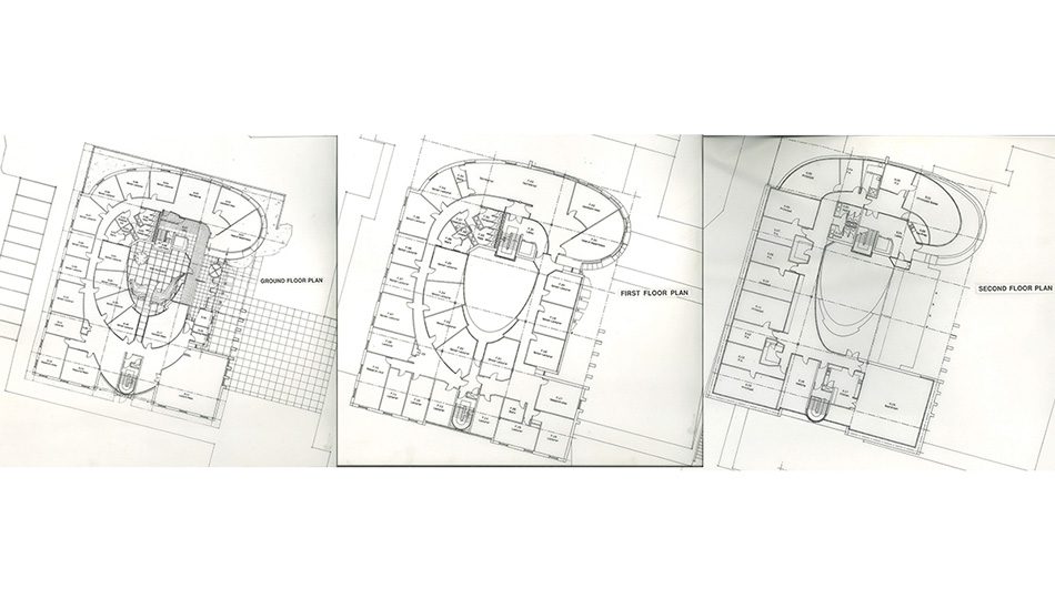
This created the potential for a principal entrance point for the campus from Cowcaddens Road. The GCU client wanted the building to portray the modern, changing image of the University, and in doing so, become a fitting tribute to the private sponsor whose name the building was to bear.
The institution’s existing buildings were very functional. Their dreary, standardised rooms were double-banked along narrow corridors that had no relief or light penetration. To satisfy the brief, we investigated a way of organising space to identify an experience separate from the other structures.
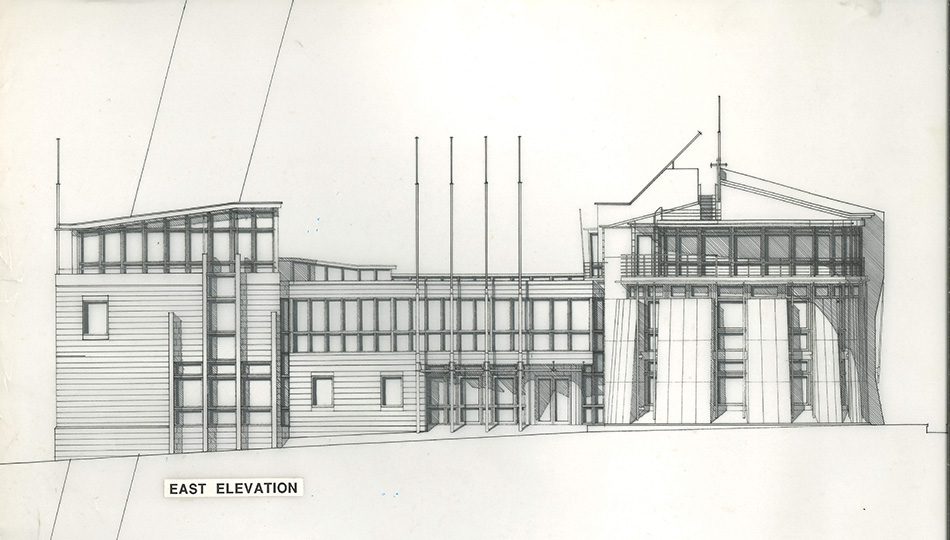
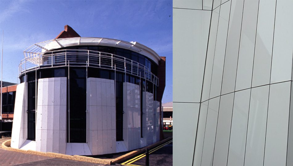
Yet the building had to remain part of a largely orthogonal and grid-based masterplan structure that drew its inspiration from Glasgow’s urban grain. The building’s south and west-facing sandstone edges shelter a white, free-form expression that addresses the internal campus square.
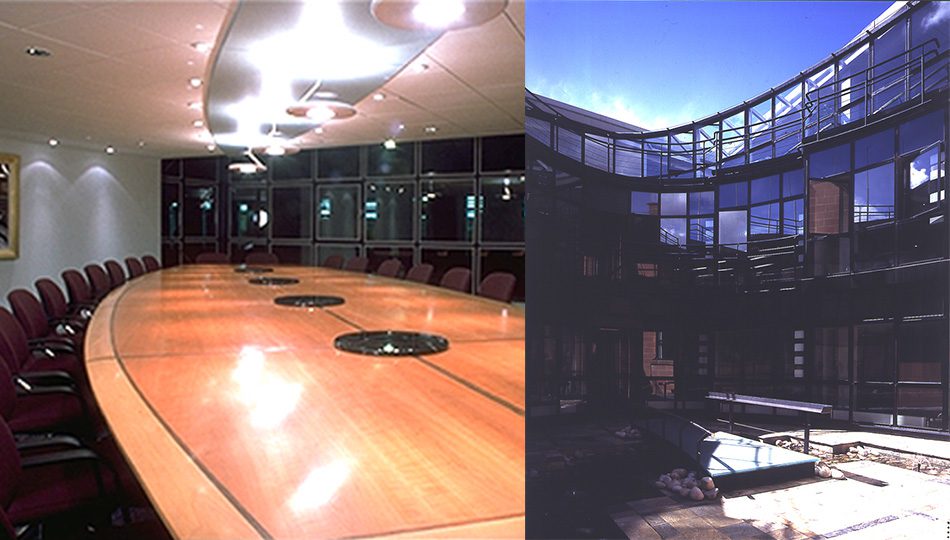
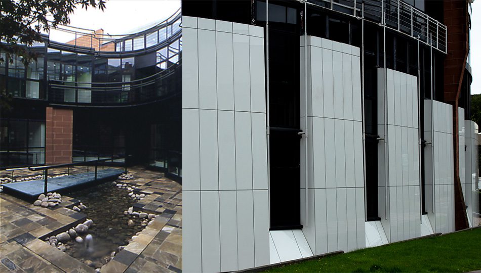
The building’s accommodation is arranged around an open central courtyard. This acted as a compositional device, allowing the planning of a curving internal circulation route. The courtyard with its Japanese style garden and water feature was regularly used for University functions.
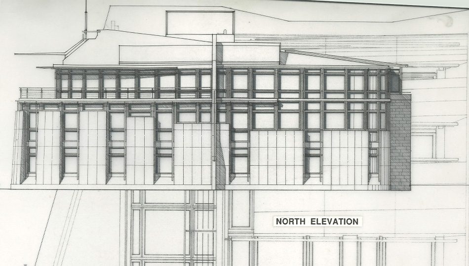
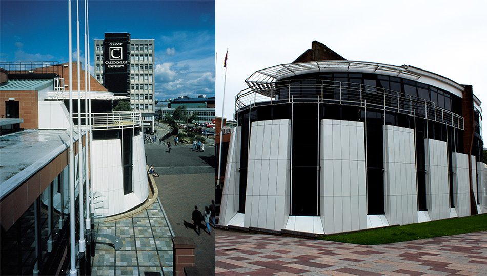
The north elevation is faced with white Neoparies panels; essentially molten glass manufactured in Japan. Due to a constantly changing plan radius and elevational rake, every panel was slightly different in size. This was the first time the product was used in the UK.
Glasgow’s newest university is building more than just a new image. (By Kathleen Rantell, for the Glasgow Herald, May 1994)
‘Glasgow’s youngest university inherited an unlovely hotch-potch of training warehouses from its less elevated past. Perhaps that is why it has been so quick to start changing its image, a decision giving Glasgow an extra trick in the 1999 City of Architecture and Design Competition.
First, Glasgow Caledonian University announced its status with an eye-catching logo emblazoned high on its nondescript blocks, signalling the name over the motorway and the city. The effect could have been awful.
Instead it is a triumph of restrained and remarkably apt design.
Now the cultural impact of the logo is to acquire solidity in a new £4m building. Architects Keppie have designed a light and airy building to flag in the new order, and a more aesthetic identity. It will house the financial services centre and the management group. Funding is in place, with half the money coming from the university’s own resources and the remainder as a low-cost £2m loan from Glasgow-based Britannia Life. Work on site is expected to begin next month with completion in June next year.
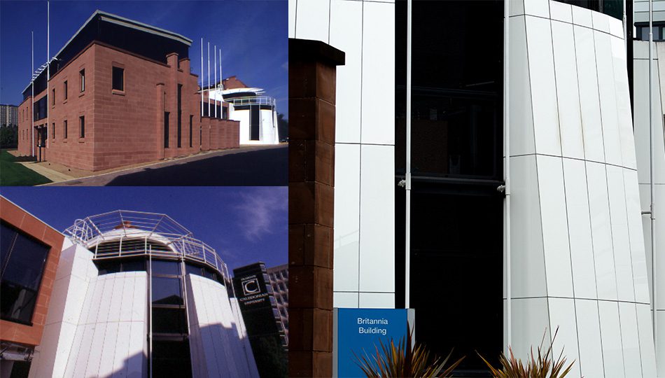
The south-facing façade of the new centre overlooking Cowcaddens Road will be formal and well-ordered, as befits a headquarters building, its mix of traditional Locharbriggs stone and glazing making a firm statement.
The design is a mercifully uncluttered product of our time with clean lines and a second floor containing the Principal’s office and the boardroom that is set back and fully glazed. There is more change to come, for the financial services centre is only the first of several varied three and four-storey buildings envisaged that will produce a strong frontage right along Cowcaddens Road to the corner of North Hanover Street.’
Several enduring collaborative relationships were formed working on this memorable project. We invited Gordon Malcolm (Project Lead from the University of Glasgow), Ken Fraser (Regional Director at Thomson Gray), and David Muir (former Regional Design Manager at BAM Construction, now retired) to share their memories:
“I was external project manager for the Britannia building at GCU, part of a larger redevelopment on the site. My lasting memory from the Britannia Building was the clever envelope consisting of traditional red sandstone facing the main road and the majority of pedestrians entering the campus morphing into the ultra-modern Japanese Neoparies cladding on the opposite elevation leading into the main area of campus renewal.
An interesting internal courtyard space with water feature is another surprise that greeted visitors calling in to meet the senior management group who occupied the building. The project was a pleasure to work on and the finished quality set a high bar for the development to follow. It’s a testament to the architect that the design has dated well.
On a personal note, I recall one discussion with the young architect who professed a preference then for small French cars and may still do!”
(Gordon Malcolm)
“A relatively “fresh faced” Quantity Surveyor at the time, I was the associate responsible for a number of projects on the new Glasgow Caledonian University campus, but the signature building was the Britannia Building which offered designers the chance to offer a statement about traditional old and new materials mirroring the creation of a new learning environment.
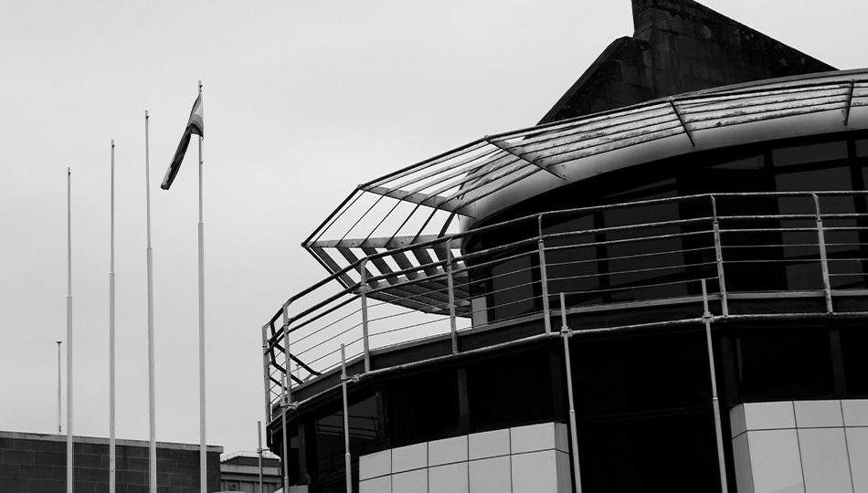
The building was affectionately known as the dalek as the curved section loosely resembled Dr Who’s arch nemesis.
As I recall it, the elevation to Cowcaddens Road reflected the traditional Locherbriggs ashlar red sandstone so prominent in the Glasgow tenements, while the opposite elevation used the ultra modern and efficient Japanese Neoparies which is made of glass ceramic and claims to have excellent durability and zero water absorption making it stronger than natural stone.
Glasgow Caledonian University was home to the newly created Department of Construction and Surveying after its move from the old College of Building & Printing hence, now perhaps old fashioned, Bills of Quantities were created attempting to accurately quantify the Neoparies element of the works.
Sadly, as this section of the building was on a decreasing radius curve and also on the batter every piece of neoparies was a different size trapezoid which became the subject of a brief surveying impasse. Fortunately, this was settled as the end product is both a worthwhile and significant part of the overall campus.
I have been advised by a member of staff who was fortunate enough to have an office in the building that it was a delight to work out of and his all-time favourite office location as an academic”
(Ken Fraser)
I joined the site team on the Britannia Building Project, after the initial site set up. THE HBG team were amused by the plan form which we thought looked like a stylised pound sign which seemed apt for the Financial Services Centre.
The curved and raking Neoparies cladding which faces the inner campus and the glazed courtyard elevations were probably our first experience of setting out in 3D. Very high standards were required to suit the off-site fabrication of these panels and curtain walling. No BIM models in those days!
I recall a significant contract issue with the courtyard glazing supplier “Crittall” who entered receivership which meant we had to temporarily weather the entire internal courtyard to allow fit out works to progress.
The alternative glazing eventually arrived and got fitted after Fraser’s pre-decorated internal partition system was virtually complete – tricky but we managed!
This led to a rollicking from my esteemed colleague Andy Isles along the lines of “Son, what are you doing, there are guys up there wallpapering outside?”
A great personal learning project with complex mix of traditional stone masonry and the various shapes and interfaces between the external materials, together with the high-quality finishes internally.
Add in to the mix the logistics of managing the Royal opening of the Caledonian University Campus by Princess Anne – all part of a contractor’s life!
Lots of design and technical issues to address on this one, many of which likely shaped my future career.
A building we should all be proud to have been involved in and still looking great.”
(David Muir)
Playing a part in a winning bid is exciting. Thirty years on, it’s no different! The anticipation remains a mix of excitement and anxiety. I recall enthusiastic lunchtime ‘replays’ of our design, picking through every detail, where could we have done more, different, or better on the Britannia Building? The possibility of winning still fills me with hope, while the chance of disappointment hangs in the background.
Design materials were modest by current standards, a product of their time. All created by the skilled hands of a committed few. I’ve always loved the mutual trust that each will deliver to an un-defined high standard – our absolute best. To this day, I’m sure our bold concept caught the eye of those driving the University’s ambitious aspirations but, deep down I secretly hoped it was the graphic ‘styling’ I promoted that really swung it!
Securing the ‘gig’ was of course the ‘easy bit.’ The Britannia Building team brought together skilled construction professionals collaborating on an innovative, often challenging journey. Synergy of attitude, and expansive expertise allowed true innovation and a real sense of ‘let’s do this together.’ I recall the daily inspiration of interfacing with the knowledge and craftsmanship of the many personalities, each willing to invest in making the vision real. It encouraged us to push the boundaries. There were of course many ‘I don’t think so’s’ from those wiser.
Close collaboration and a progressive client allowed us to experiment with new materials, systems, and products. A particular stand-out being the adoption of the gleaming white crystallized glass Neoparies, a material considered internally for its consistent marble-like appearance with soft and subtle reflections and subsequently adopted externally in larger format for its visual appeal, hardness, and resistance to almost everything.
This became the buildings signature white curve.
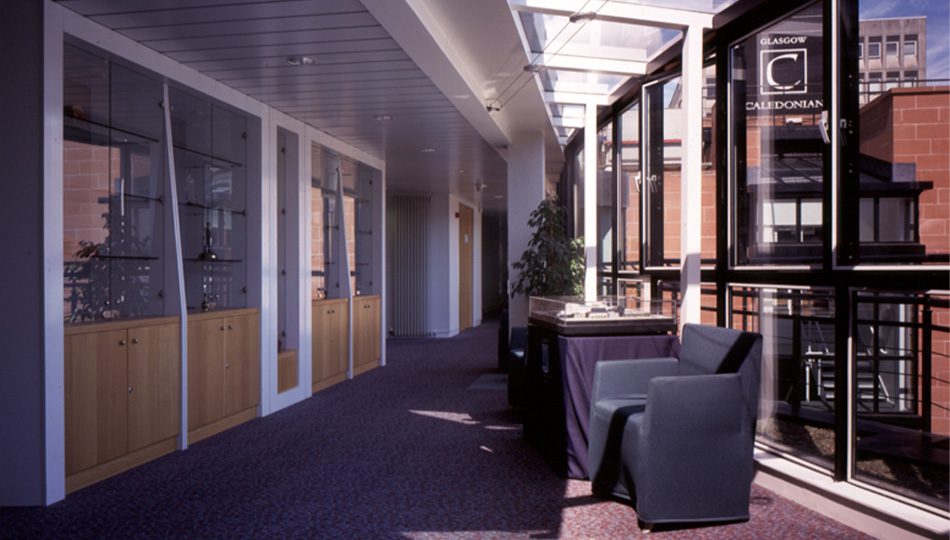
As designers we grasped the many opportunities to create technically excellent, user functional and visually stunning spaces. The interior marries bespoke furniture, environmental systems, and unique interior elements within a light-washed workplace capable of being both open and private. Collaborations with specialists developed custom solutions e.g. an innovative lighting strategy encouraged the illumination of internal corridors with daylight captured via extensive glass partitioning from courtyard facing rooms.
None of us are perfect, so the story of the curving shelves stays with those involved…who knew paper could be that heavy?
Engaging with these talented professionals taught me the value of communication and mutual respect in the creative process. By working together, we crafted an innovative workplace deeply reflective of the clients’ needs and aspirations.
1993-95 really was a long time ago!