Client
NHS Greater Glasgow and Clyde
Contact
Andrew Baillie, hub West Scotland
Dates
Completion 2020
Value
£10m
Area
500 sqm
Status
Completed


Awards

Scottish Property Awards 2021
Healthcare Development of the Year - Winner
Scottish Property Awards 2021
Development of the Year (Public Buildings) - Finalist
Scottish Property Awards 2021
Architectural Excellence (Public Use) - Finalist

Civic Trust Awards 2022
Regional Finalist

GIA Awards 2021
Commendation – Healthcare

Scottish Design Awards 2021
Health Building or Project - Winner
NHS Scotland Assure Awards 2022
Design Excellence Award - Highly Commended
creating a calming, non-clinical environment
As part of their wider mental health services strategy NHS Greater Glasgow and Clyde (NHS GG+C) proposed to re-provide a 20-bed adult facility (AAU) to replace existing facilities at Parkhead Hospital, and a 20-bed elderly ward (CCC) that will replace an element of the bed capacity at Birdston Nursing Home. These would be supplemented with associated staff and clinical support facilities.
Keppie were selected as designers for the project following a competitive process run by Hub West. Our ideas that went into the development of our proposals are resolutely people focused; seeking to provide a considered and balanced environment which is welcoming, caring, calming and non-clinical.
The original Stobhill Hospital was designed by the architects, Thomson & Sandilands for the Parish of Glasgow and constructed over a 5-year period, opening officially in September 1904, originally functioning as a ‘Poor House’. In 1939 the hospital was transferred from the Parish Council to Glasgow Corporation, then moved again onto the NHS in 1948.
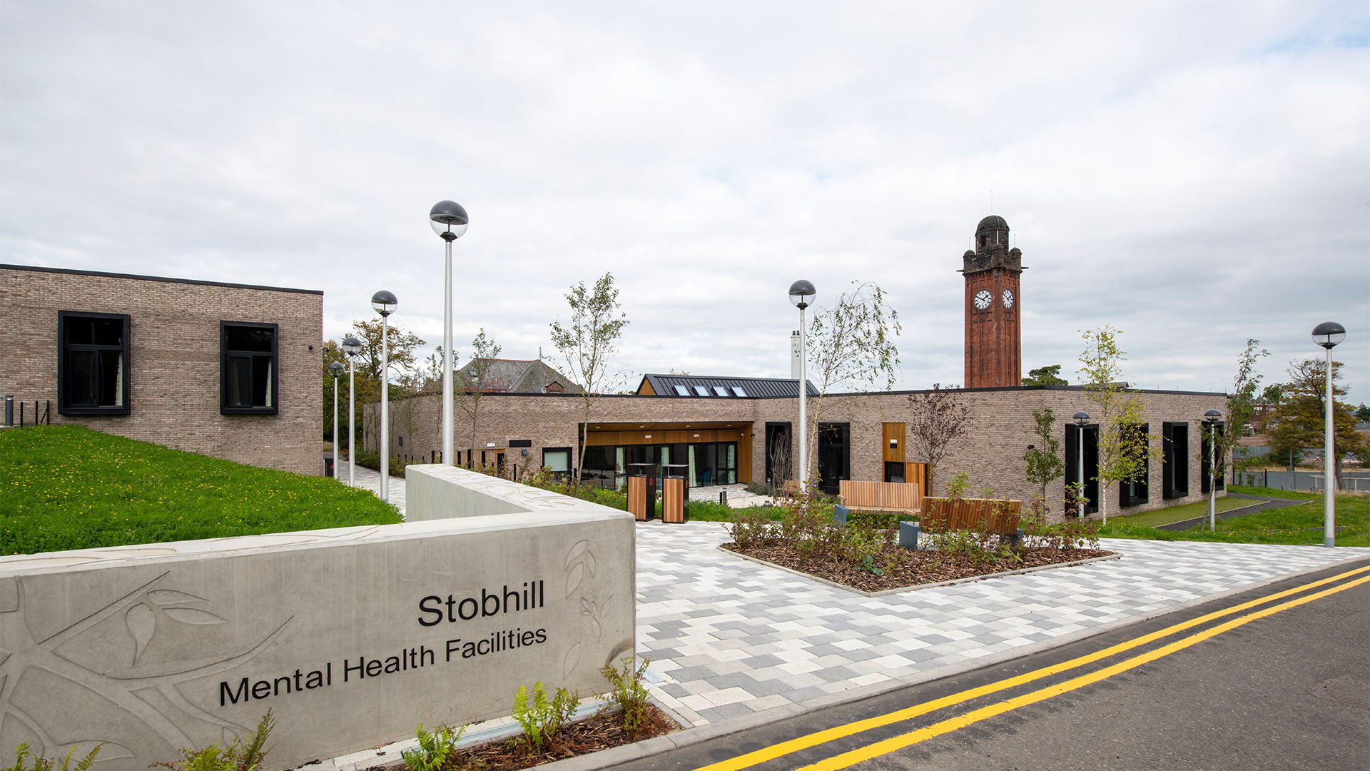
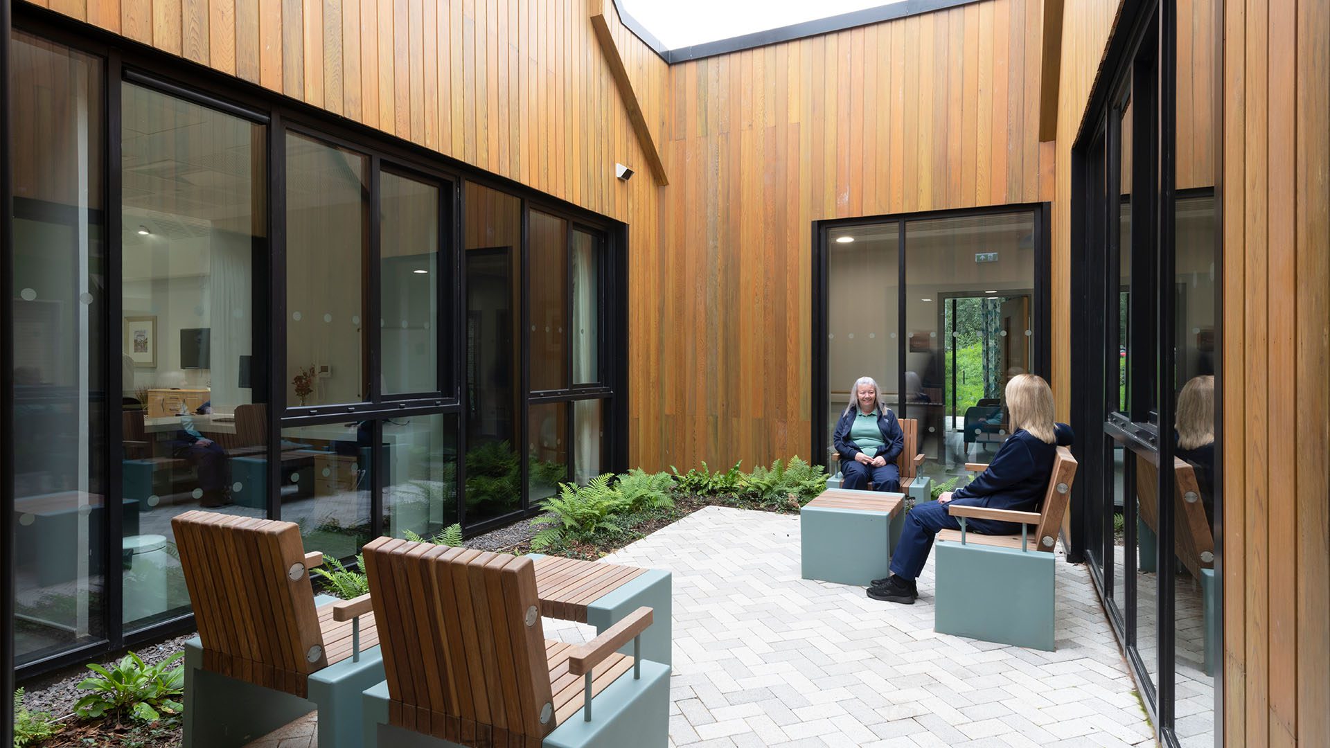
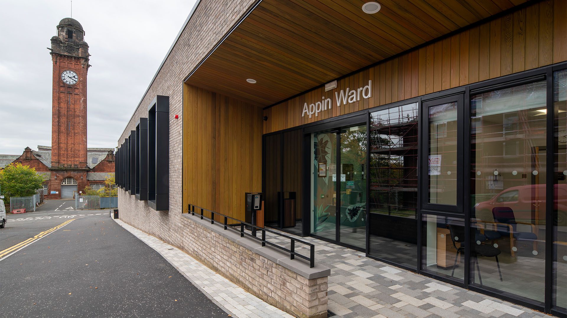
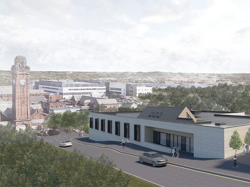
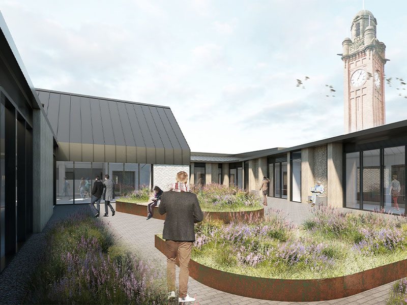
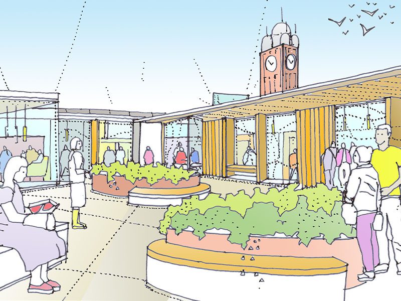
Currently, the site is occupied by 3-day units, two of which formed part of the original hospital campus plan. These had been deemed unfit for purpose by the NHS and their demolition is part of phased development masterplan, also by Keppie. Adjacent to the site is a landmark B-listed Water Tower of significant local importance. It provides an orientation point seen from several notable points across the city. As our ideas developed, the constancy of a view of the Water Tower from calm internal courtyards became a consistent design driver.
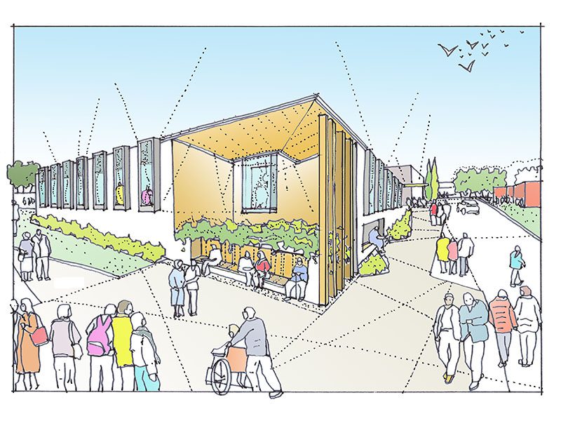
Our separate buildings address the street with an elevated hard edge, which allows for the entrance recesses to be clearly defined and affords privacy to the occupants. Due to the proximity of an existing car park to the south of the site, the built form is located to the north of the site, allowing for large planted south-facing external spaces to form a buffer between the two.
The pattern of an existing footpath through the site is honoured in our design. Its reinterpretation adds permeability to the scheme and aids the campus-like feel. Using the topography to its best advantage, the feature space to the north-east of the site directly facing the existing Water Tower forms a stopping point for the public without disturbing the occupants of the building.
The key driver of the proposal is the aspiration to provide welcoming and non-clinical spaces that enhance the dignity of their occupants, while addressing the procedural, operational and brief requirements as outlined by NHS GG+C. These points have formed a starting point for the design for the Stobhill Mental Health Estate from the beginning, influencing all key decisions from site arrangement to material choices and finishes.
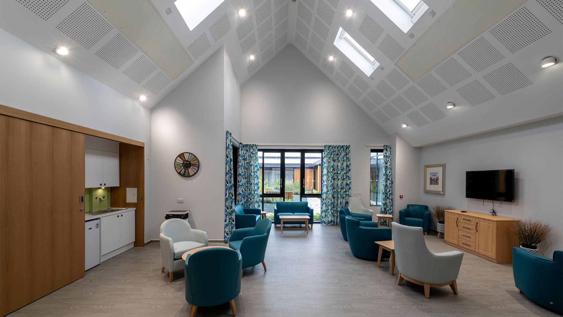
The building strategy closely follows the site and spatial adjacencies requirements, with the service user and staff + operational zones clearly separated by secure lines, beyond which visitors become invited guests. Day spaces are grouped directly adjacent to external green space, with the larger volumes of the main sitting and dining areas facing East to maximise ingress of beneficial morning light. Views back to the day spaces encourages service users to leave their bedroom.
Bedrooms wrap round large courtyards to maximise staff observation, whilst providing therapeutic aspects both on entering and exiting the bedroom. All bedrooms receive natural daylight as well as connections to the site and wider campus.
Several studies were carried out focusing on the external expression of the elevations and means of breaking up the planes. The use of varying brick courses and pre-cast concrete panels was considered as a means of accentuating the ‘plinth’ which extends underneath both buildings due to the change in topography. Ultimately, the simplicity of combining light coloured brick, warm timber and contrasting dark aluminium fixtures influenced the decision to keep the brick façades as minimalist as possible.
